Design Admin Area
Restructure the Hub admin into a clean WDS “Design” area.
Overview
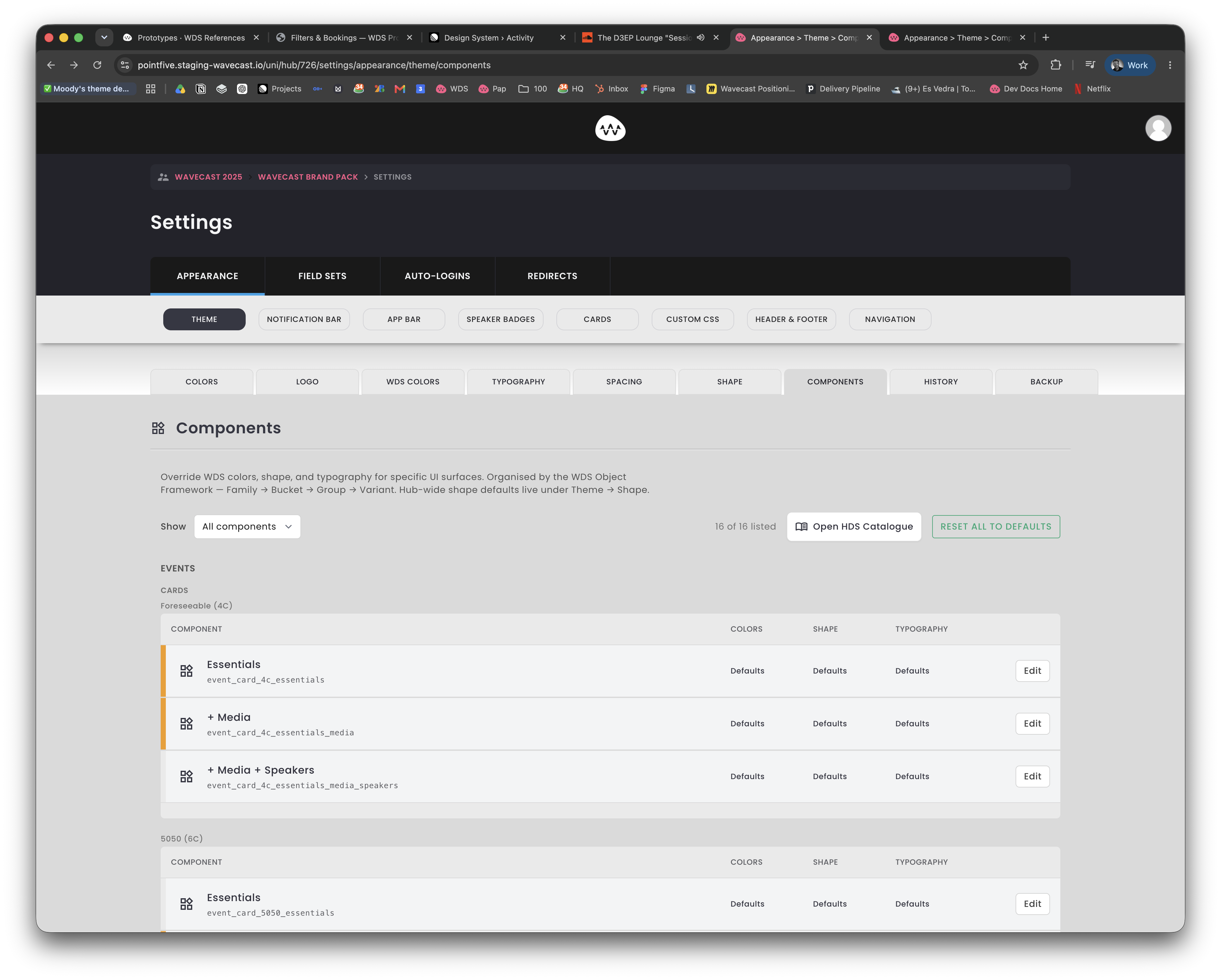
The Hub design admin in Papillon, currently Appearance › Theme, has grown a stacked, inconsistent set of tabs. Two competing tab patterns sit on top of each other, labels use American spellings, a deprecated Cards panel is still shown, and read-only documentation lives alongside live controls.
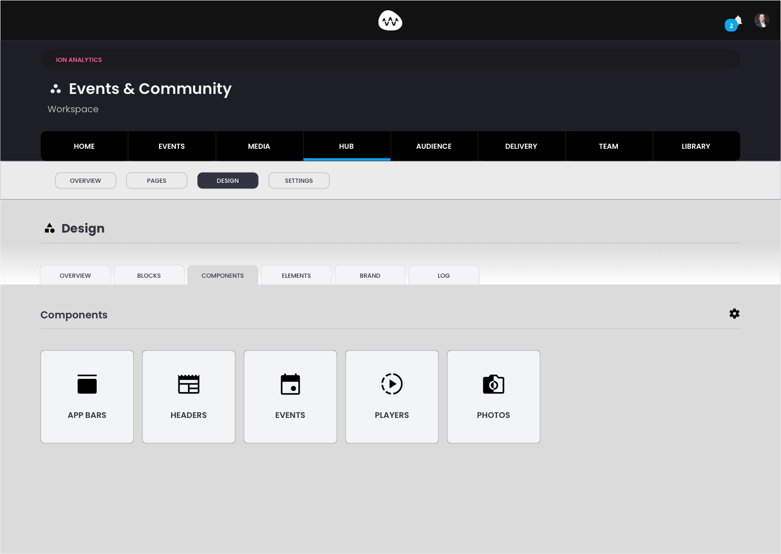
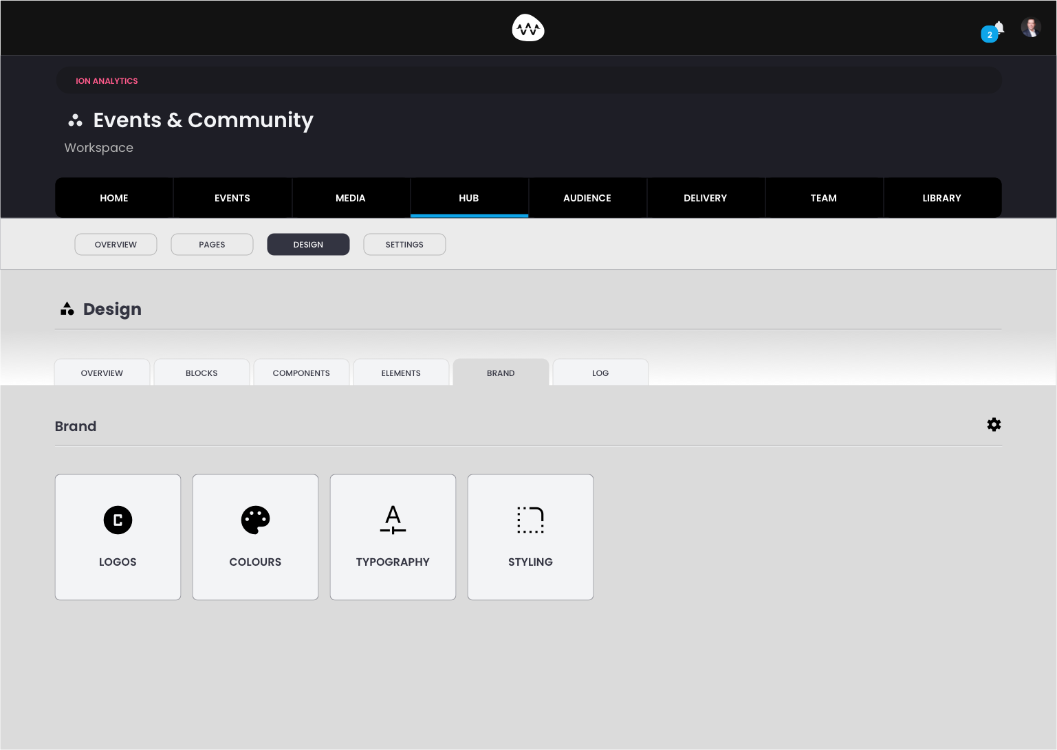
The direction, shown in the screens below, is the WDS Workspace Design area: one clean tab row, each tab landing on a grid of icon tiles. Rename Appearance › Theme to Design, landing on Overview · Blocks · Components · Elements · Brand · Log. Brand lands on Logos, Colours, Typography and Styling; Components lands on App Bars, Headers, Events, Players and Photos. This package brings the screen in line with the Wavecast Design System and that layout.
Screenshots
Changes
Appearance tabs
| Theme | Rename→ | Design sub-section |
| Notification Bar | Move→ | Design › Components |
| App Bar | Remove | Off Design · Settings or Pages |
| Header & Footer | Remove | Off Design · Settings or Pages |
| Navigation | Remove | Off Design · Settings or Pages |
| Speaker Badges | Move→ | Design › Brand › Colours |
| Cards | Remove | Deprecated |
| Custom CSS | Move→ | Settings |
App Bar, Header & Footer and Navigation come off the Design screen entirely. Their config belongs in Settings or Pages; their theming stays as the App Bars and Headers tiles under Components.
Theme sub-tabs
| Colours (old list) | Remove | Deleted |
| Logo | Move→ | Design › Brand |
| WDS Colors | Rename→ | Design › Brand · “Colours” |
| Typography | Move→ | Design › Brand |
| Spacing | Remove | Read-only doc, not relevant |
| Shape | Rename→ | Design › Brand · “Styling” |
| Components | Move→ | Design › Components |
| History | Rename→ | Design › Log |
| Backup | Move→ | Design › Overview |
Also in scope
- British spelling throughout: Colours, not Colors. No “HDS” (rename “Open HDS Catalogue” to WDS), no “WaveCast”, no em dashes.
- Accent Rose is interactive-only. The green “Reset all to defaults” button is wrong; interactive actions use Rose, secondary actions a neutral outline.
- One tab idiom per level. Do not stack two competing tab patterns.
- Brand tiles only appear once the Brand Pack is installed and tokens are set; a pre-install state is needed before then.
Build pack
The Cursor-ready package. Not the brief itself; Bruno refines this into a plan and supervises execution in Cursor. Bruno and Georgia review from the Overview above.
↓Download build packCursor prompt. Markdown spec to prompt and build from.TargetPapillon Hub admin · Appearance → DesignScopeThis admin area onlyView prompt inline
# Cursor prompt: bring the Hub “Design” admin in line with WDS

Paste everything below into Cursor. It is self-contained: all token values, naming rules and the full information-architecture map are included. Do not fetch anything external.

---

## Context

You are working on the Papillon admin (the Wavecast Hub back-office). The screen in scope is the Hub design admin, currently at `…/settings/appearance/theme/…`. Today it is labelled **Appearance › Theme** with a stacked, inconsistent set of tabs. We are restructuring it to match the Wavecast Design System (WDS) and the agreed target layout.

Scope is this admin area only. Do not change unrelated screens.

## Goal

1. Rename and restructure the sub-section from **Appearance | Theme** to **Design**, with a single clean tab row.
2. Migrate every existing tab/panel to its correct new home (or remove it).
3. Apply WDS visual conventions throughout.
4. Match the target card-tile landing pattern.

---

## WDS conventions (non-negotiable)

**Spelling & naming**
- British spelling everywhere in UI copy and labels. “Colours” not “Colors”. “Standardise” not “Standardize”.
- Product is styled **Wavecast** and **WDS**. Never “WaveCast”. Never “HDS”. Rename any “HDS” string (e.g. “Open HDS Catalogue” becomes “Open WDS Catalogue”).
- No em dashes in any UI copy.

**Colour**
- **Accent Rose `#fe2767` is interactive-only.** Every clickable control (buttons, links, active tab, active toggle) uses Rose for its active/interactive treatment. Never use Rose as a decorative tint.
- **Green (logo green `#15803d`) is never an interactive control colour.** The current green outlined “Reset all to defaults” button is wrong: make destructive/secondary actions use a neutral outlined style, and primary/interactive actions use Rose.
- **Gold / champagne `#d8b15a`** = non-interactive emphasis only (rules, dividers, tags, framed borders).
- **Sky `#0ea5e9`** = structural brand (headers, brand moments, non-interactive accents).
- Bind to token names/CSS custom properties where available; do not hard-code hex when a token exists.

**Colour reference values**
- Text · Light: Text 1 `#000000`, Text 2 (muted) `#71717a`, Link `#fe2767`. Dark: Text 1 `#ffffff`, Text 2 `#a1a1aa`.
- Surfaces (Zinc) · Light: White `#ffffff`, `#fafafa`, `#f4f4f5`, border `#e4e4e7`, border-strong `#d4d4d8`.

**Navigation idiom**
- One tab idiom per level. Do not stack two competing tab patterns (e.g. dark pill tabs directly above underline tabs). Sub-section pills (Overview / Pages / Design / Settings) are one level; the Design tab row is the level below.

---

## Target structure

Rename the sub-section **Appearance | Theme → Design**.

The Design sub-section lands on ONE tab row, in this exact order:

`Overview · Blocks · Components · Elements · Brand · Log`

Each tab lands on a card-tile grid: equal square tiles, each an icon plus a label, on light Zinc surfaces. Section header = icon + title on the left, a settings cog on the right (match the existing Brand/Components header pattern).

- **Brand** tiles: `Logos · Colours · Typography · Styling`
- **Components** tiles: `App Bars · Headers · Events · Players · Photos` (this row grows as more WDS Object Framework buckets are documented)

Tile icons come from the WDS icon library.

---

## Migration map: move every existing panel to its new home

**Existing Appearance-level tabs**

| Existing tab | Action | New home |
|---|---|---|
| Theme | Rename | Becomes the Design sub-section itself |
| Notification Bar | Move | Design › Components |
| App Bar | Remove from this screen | Settings or Pages (config). Its theming lives at Design › Components › App Bars |
| Header & Footer | Remove from this screen | Settings or Pages |
| Navigation | Remove from this screen | Settings or Pages |
| Speaker Badges | Move | Design › Brand › Colours |
| Cards | Remove | Deprecated. Delete from this screen |
| Custom CSS | Move | Settings |

Note on App Bar / Header & Footer / Navigation: they must come off the Design screen. Whether their config sits under Settings or Pages is out of scope for this task; just remove them here. Their visual theming remains as the App Bars and Headers tiles under Design › Components.

**Existing Theme sub-tabs**

| Existing sub-tab | Action | New home |
|---|---|---|
| Colours (old list) | Remove | Delete |
| Logo | Move | Design › Brand |
| WDS Colors | Rename to **Colours**, move | Design › Brand |
| Typography | Move | Design › Brand |
| Spacing | Remove | Read-only documentation, not relevant. Delete |
| Shape | Rename to **Styling**, move | Design › Brand |
| Components | Move | Design › Components |
| History | Rename to **Log**, move | Design › Log |
| Backup | Move | Design › Overview |

---

## Brand gate behaviour

The Brand tiles (Logos / Colours / Typography / Styling) only appear once the client’s **Brand Pack is installed and all tokens are set**. Before that, render a pre-install state on the Brand tab rather than empty or broken tiles.

Recommended: show the four tiles in a locked/disabled treatment with a single primary “Install Brand Pack” call to action (Rose, interactive). Confirm the exact copy and behaviour with Alex before finalising.

---

## Acceptance checklist

- [ ] Sub-section reads **Design**, not Appearance/Theme.
- [ ] Tab row is exactly: Overview · Blocks · Components · Elements · Brand · Log, one idiom, no stacked tab patterns.
- [ ] Brand lands on Logos / Colours / Typography / Styling tiles; Components lands on App Bars / Headers / Events / Players / Photos tiles.
- [ ] Every row in the migration tables is either moved to its stated home or deleted. Cards, old Colours list and Spacing are gone. Backup is on Overview.
- [ ] All labels use British spelling; no “Colors”, no “HDS”, no “WaveCast”, no em dashes.
- [ ] No green interactive controls; interactive actions use Accent Rose `#fe2767`; “Reset all to defaults” is neutral/secondary, not green.
- [ ] Brand tab shows a defined pre-install state when the Brand Pack is not installed.
A readable overview, the reference screens, the changes, and the Cursor build pack.