Examples · 5050
+ Media — Examples
The + Media variant's four media containers — Skyscraper, Vertical Media, Square, Letterbox — across the density ramp, plus the compact data state. Settings are configured per use.
01
Media containers & data
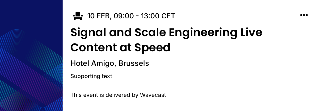
6C · two-up grid6C cards are half a 5050 split, so they render two-up — previewed here in the 2-column grid they actually appear in, at the real Hub 16px gutter, in Light and Dark. The four media containers — Skyscraper, Vertical Media, Square, Letterbox — across the density ramp (top two rows, full data), then the compact data state (bottom row).


Notes
- Cards scale to the column to mirror the real two-up 5050 split — the grid is 2 columns. The media container is a setting on one component; the copy slots and type ramp are unchanged across all four.
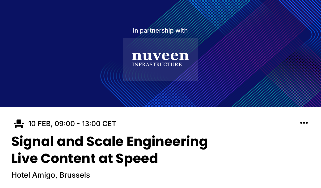
- Letterbox (3:1) is the container; the sponsor logo + "in partnership with" tagline are a separate overlay on it (white in both modes), not part of the container. Shown at Large here; Small and Medium use the same container (examples to follow).
- Title_Short precondition — the Square container at Large narrows the copy area, so the data must supply
Event Title_Short. Authors selecting Square at a larger size are prompted for the short field. - Supporting slot and Footnote are settings-driven optional slots — present in full data, hidden in the compact (bottom) row.
Events · Cards · 5050 · + Media · Examples
The three media containers beside the same Essentials copy, and the compact vs full data state. Square at Large requires Event Title_Short.
The three media containers beside the same Essentials copy, and the compact vs full data state. Square at Large requires Event Title_Short.