Ready
Variant · Page Headers
↓
Download build packReady to build. Markdown spec to prompt and build from.
Sketch docWDS Design System v4.0
Sketch pagePage Header
Cover
Content over a full-bleed cover.
01
Details
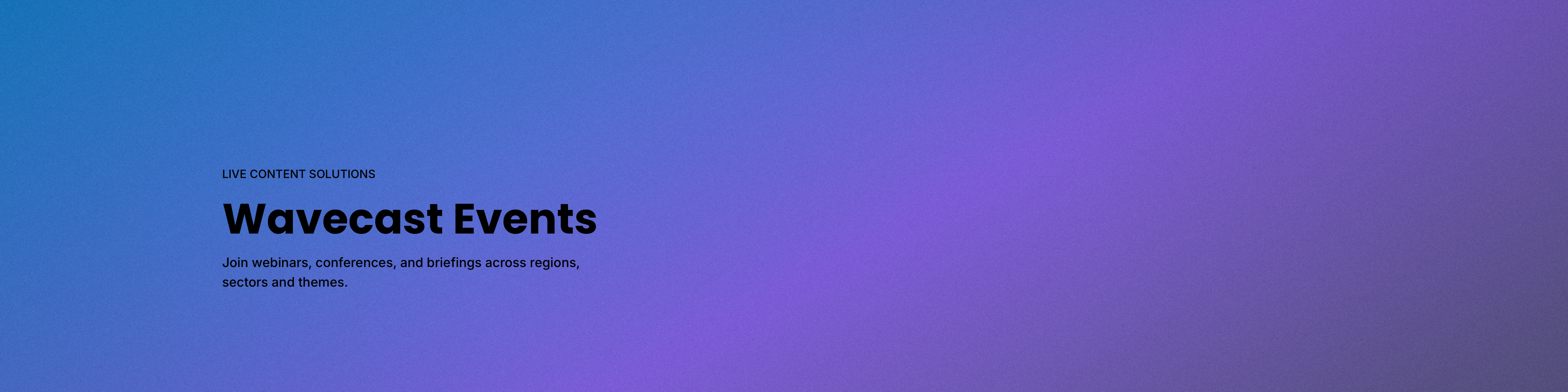
Layout · Cover (content over a full-bleed cover · 1920 × 480)
TierComponent
FamilyPage Headers
VariantCover (content over full-bleed)
BackgroundMedia (image or video)
Content container1 slot (fill: Video Player, extensible)
Canonical namePage Headers / Cover
IDpage-headers-cover
02
Component Anatomy
| # | Layer | Colour | Data | Notes |
|---|---|---|---|---|
| 1 | Background media | Media | Image / video | Fills the entire 1920 × 480 band, edge to edge. Mode-agnostic artwork; the content sits over it. |
| 2 | Eyebrow | Text 2 | Section kicker | The muted label above the title. Uppercase, Text 2 in both modes. |
| 3 | Title | Text 1 | Page title | The page heading, flush left. Non-interactive; Text 1. |
| 4 | Subtitle | Text 1 | Supporting line | One or two supporting lines beneath the title. |
| 5 | Content container | Accent | Slotted object | An optional foreground slot in the media zone. Fill = a Video Player today (play mark in Accent); a registration form, interactive map or other object can occupy the same slot. |
Notes
- Basic content core. Eyebrow, title and subtitle are always present. The background media and the content container are the layers that vary.
- Content container is a slot, not a video. Video Player is the first fill; the slot is designed to accept other objects (quick registration, interactive map) without new variants.
- Rose is interaction-only. The only Accent in the resting header is the interactive control of whatever fills the slot (e.g. the video play mark).
03
Spacing
| Element | Position | Size |
|---|---|---|
| Band | Full-width, page top | 1920 × 480 |
| Background media | Fills the band (artwork bleeds) | 1920 × 480 |
| Content block | Left, x 272, vertically centred below the App Bar (offset +40) | w ~760 |
| Content container | In the media zone, y 96 | 512 × 288 (16:9) |
Notes
- App Bar offset. On the page the App Bar (80px) sits on top of the band, so the content block is centred in the area below it (the band's lower 400px), offset down 40px from the full-band centre.
- Full-bleed by design. The band spans the full 1920, not inset to the 1376 content grid the page body uses.
04
Typography
| Slot | Role | Metrics |
|---|---|---|
| Eyebrow | Callout / base | Inter 14 / SemiBold · uppercase |
| Title | Display / base | Poppins 52 / Bold |
| Subtitle | Subhead / base | Inter 16 / Medium |
Notes
- Each slot is bound to a shared text style on the WDS type role grid (an LM/DM pair). Metrics are owned by the Typography Role Registry; the page mirrors them.
- Eyebrow takes the Callout role with a Text 2 colour override for the muting, not a separate style.
- Because the content sits over the media, confirm text contrast against the artwork per use.
05
Examples
Notes
- The preview toggles the content container (None / Video Player) in Light and Dark. Further slot fills (registration, map) will be added as they are designed.
Page Headers · Cover
The full-bleed layout: the Basic content sits over a cover-filling background media (image or video), with an optional foreground content container. Details mirror the live Sketch source (WDS Design System v4.0).
The full-bleed layout: the Basic content sits over a cover-filling background media (image or video), with an optional foreground content container. Details mirror the live Sketch source (WDS Design System v4.0).