Working draft
MHN Brand Pack · Logos
MHN Logos
01
Overview
Prepared for Haymarket. A working view of the MHN logo set as we hold it today, with our proposed usage for each type and the points we need you to confirm so we can lock the system.
This is a working document to agree the logo types and their intended usage before we bind them into our authoring, design and development workflows.
Open questions are flagged in amber for Haymarket to confirm or iterate with us.
02
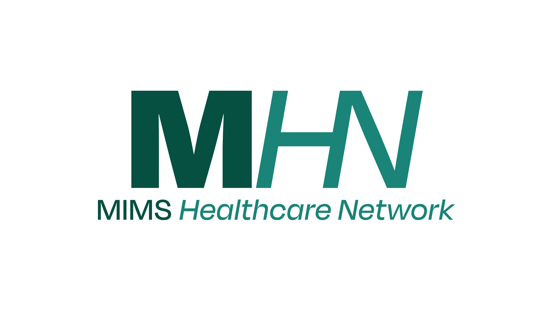
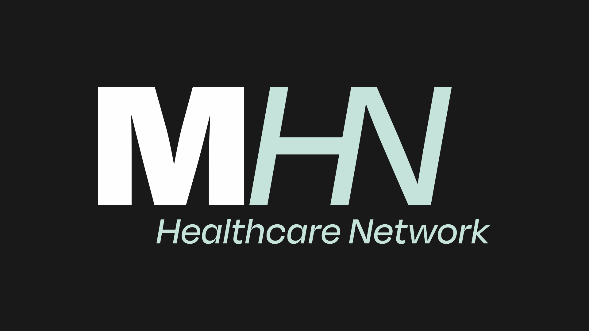
The full lockup: the MHN monogram with the "MIMS Healthcare Network" wordmark. The default identity.
Open question — wordmark consistency
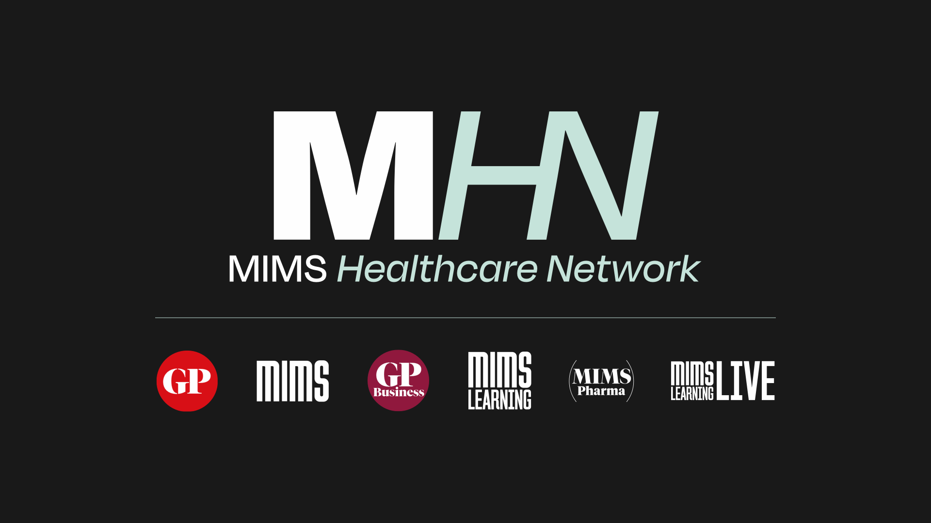
The dark-mode logo drops the "MIMS" prefix (it reads "Healthcare Network"), while the light-mode logo and both Compact variants keep "MIMS". Is this intentional? Our recommendation is to make the wordmark consistent across modes unless there is a deliberate reason to shorten it on dark.
03
Compact
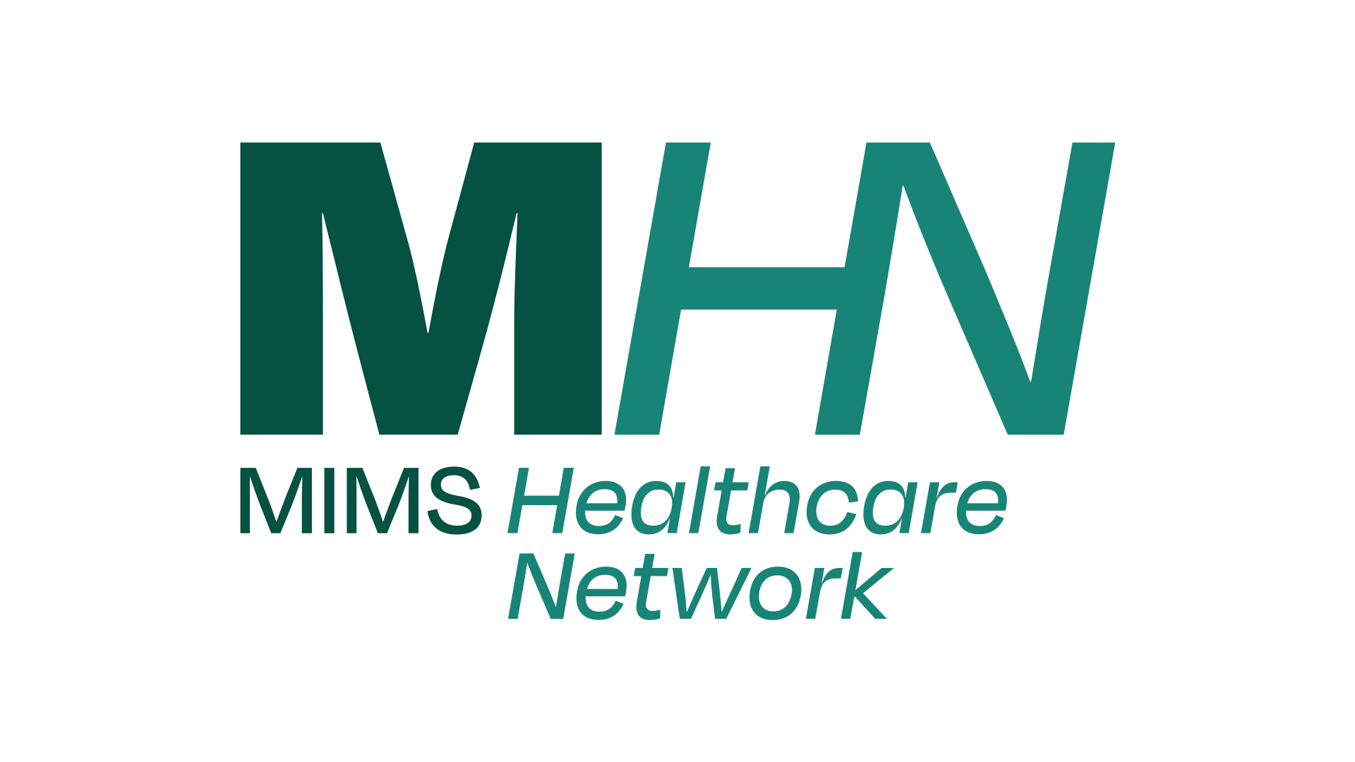
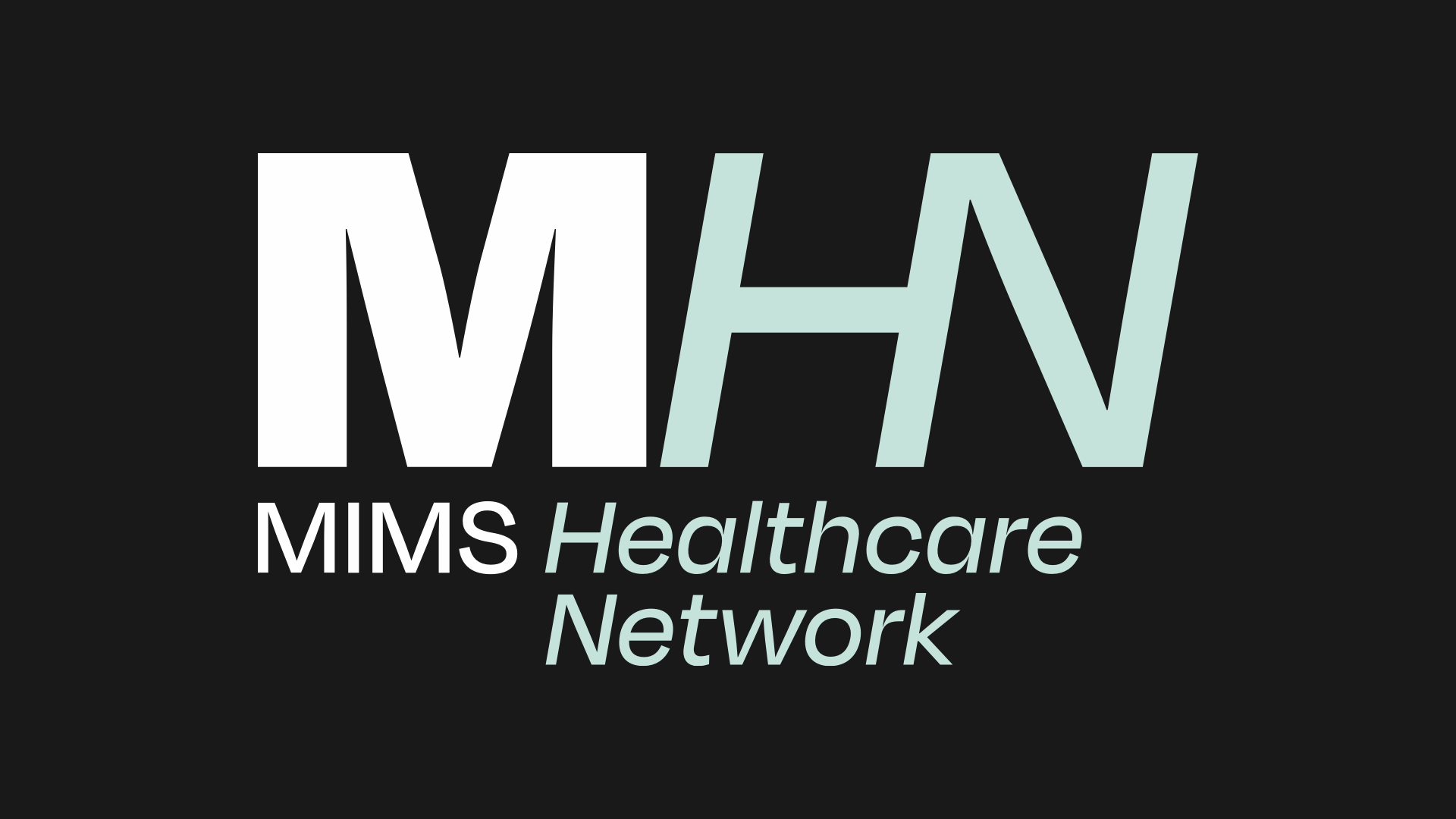
SuppliedThe same monogram and wordmark, with the wordmark wrapped to two lines for a squarer, tighter footprint.
Open question — is Compact a distinct type?
As delivered, the Compact and the Primary Logo are near-identical: same monogram, same wordmark, only the line-wrap changes. In the system they can't occupy meaningfully different spaces or serve different applications, so they read as one logo. We should either (a) give Compact a defined role with its own minimum size and clear-space so it earns its place, or (b) collapse to a single logo. Note too that Compact keeps "MIMS" in dark mode whereas the Primary Logo drops it.
04
Icon / Bug
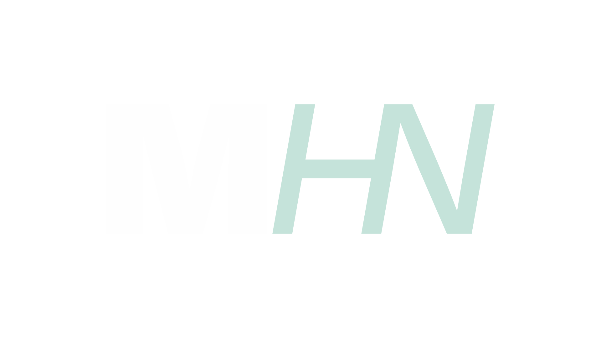
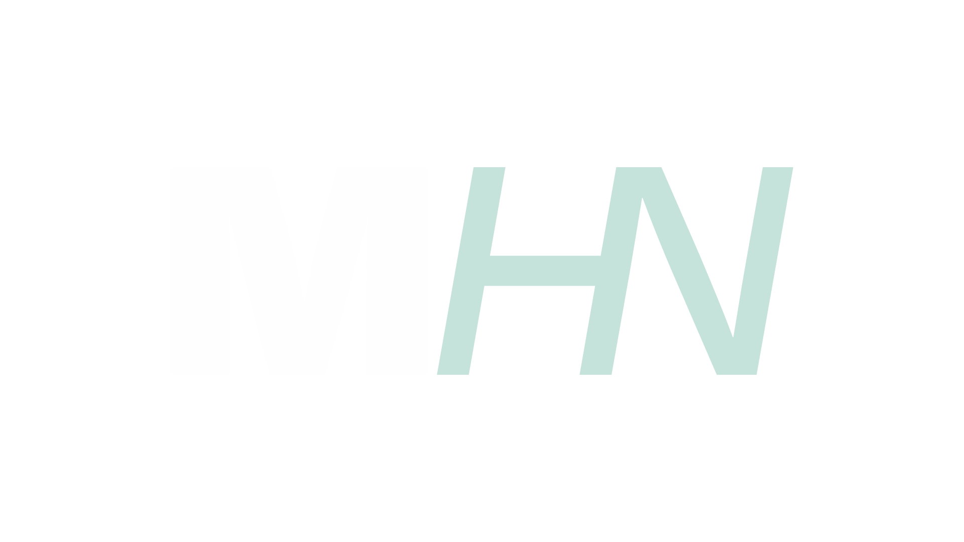
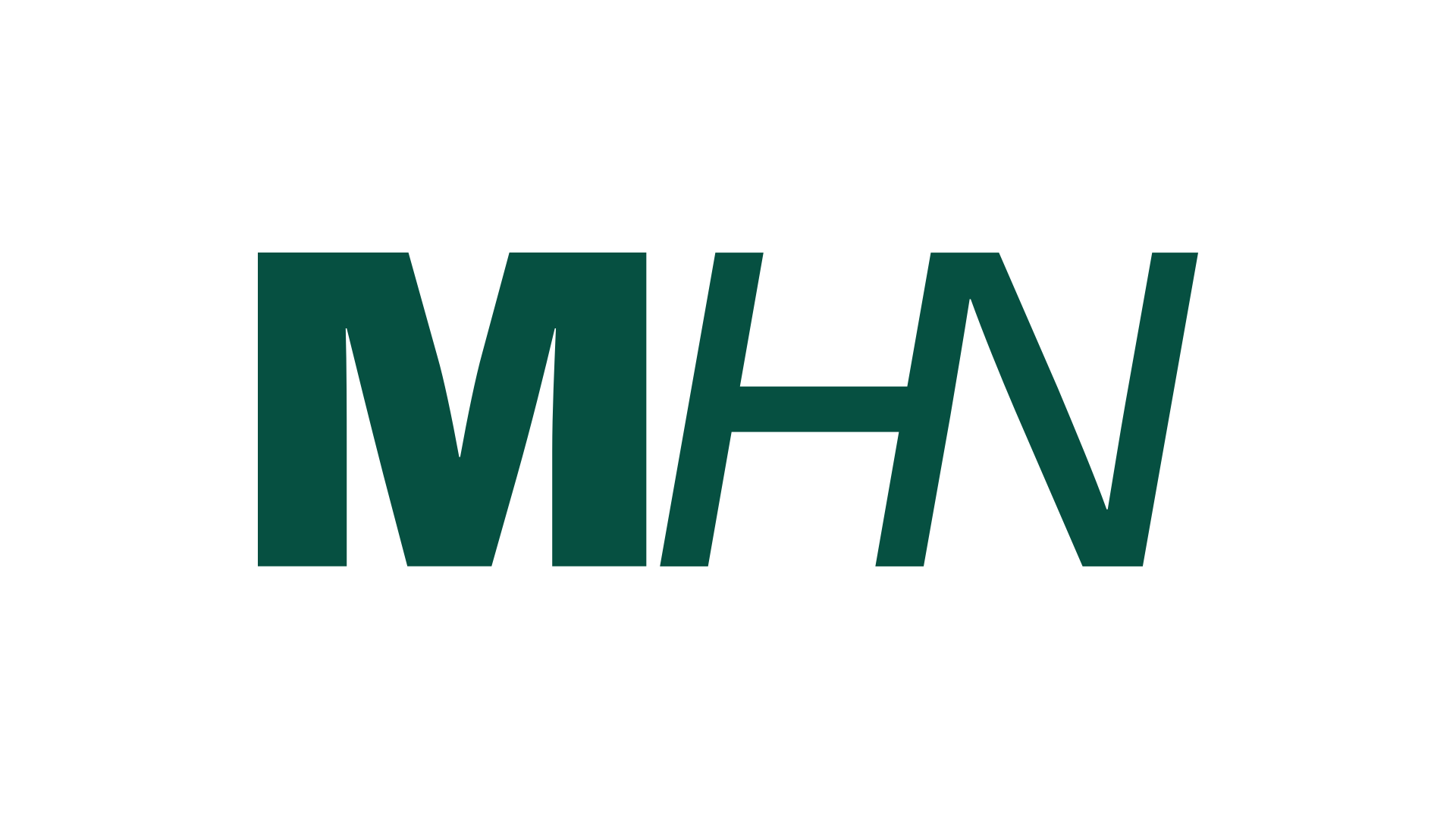
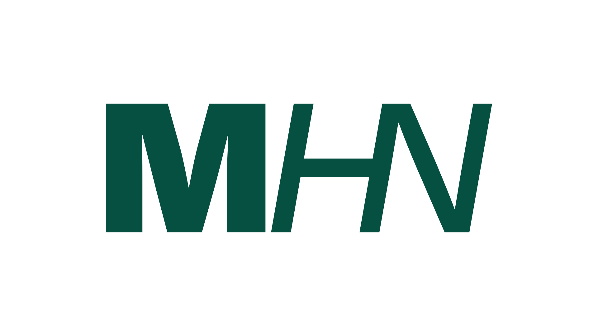
ProposedA clean monogram-only mark, the MHN Logomark (the letterforms, no words). Not part of Haymarket's supplied set; proposed here from a working file for review. Shown in three treatments, Colour, Dark and Light, as SVG and PNG.

Proposal — adopt a monogram icon
We propose adopting this monogram-only mark as the MHN icon / bug: a logo bug in the corner of videos and a watermark on video and photo media, where the full wordmark is too busy or too small to read. This is a working file, not yet part of the supplied set. For Haymarket to approve or refine, and to provide as the master.
05
Network Lockup
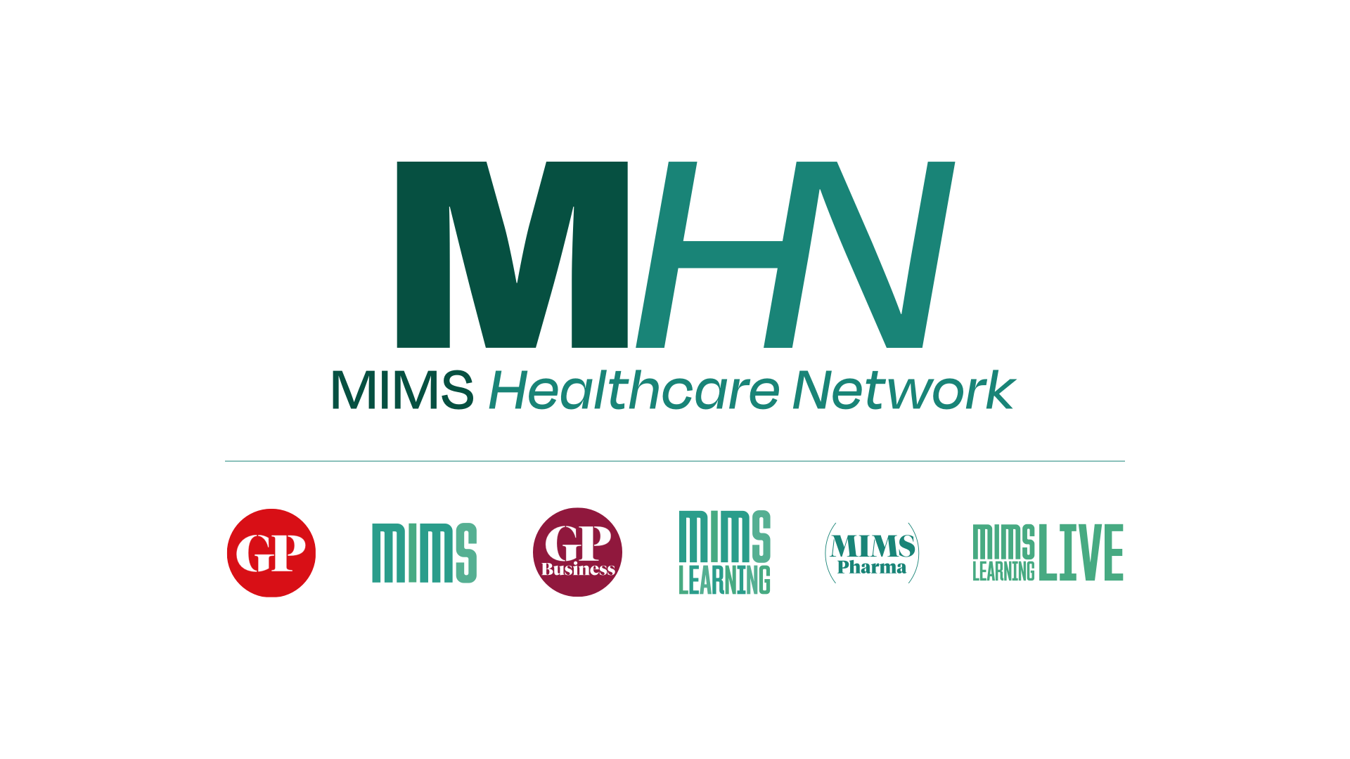
SuppliedMHN presented with its member brands. The endorsement lockup for "our network" moments.
Open question — is the brand order canonical?
The lockup lists six member brands in this order: GP, MIMS, GP Business, MIMS Learning, MIMS Pharma, MIMS Learning Live. Is that order meaningful (seniority, audience, alphabetical by something) or arbitrary? We will encode whatever order you confirm so it is consistent everywhere the network is shown.
06
Network Brands
SuppliedThe six member brands, in the lockup order. Light-mode marks shown; the MIMS-family marks also have dark-mode versions.
GPbadge · fixed colour
MIMSLM / DM
GP Businessbadge · fixed colour
MIMS LearningLM / DM
MIMS PharmaLM / DM
MIMS Learning LiveLM / DM
Open question — per-brand treatment
GP and GP Business sit on solid colour badges (red and maroon) and keep that colour in both modes; the MIMS-family marks switch between light and dark. Please confirm this is the intended per-brand treatment, and whether any member brand also needs its own icon/bug for tight placements.
07
Open Questions
For HaymarketThe decisions to agree, consolidated. Once settled, these definitions drive how the right logo is chosen automatically in authoring, design and development.
| # | Question | Our recommendation |
|---|---|---|
| 1 | Dark-mode Primary Logo drops the "MIMS" prefix; the rest keep it. | Make the wordmark consistent across light and dark. |
| 2 | Compact and Primary Logo are near-identical and can't serve different spaces. | Give Compact a distinct role and minimum size, or collapse to one logo. |
| 3 | No icon-only mark in the supplied set; we have proposed a monogram mark (Colour / Dark / Light). | Approve or refine the proposed icon / bug, and provide it as a master. |
| 4 | Network Lockup shows six brands in a set order. | Confirm whether the order is canonical; we will encode it. |
| 5 | Mixed per-brand treatment (fixed-colour badges vs LM/DM marks). | Confirm the treatment per brand, and any per-brand icon needs. |
| 6 | Assets are 16:9 raster crops with baked backgrounds. | Supply vector (SVG) and transparent-background versions so a mark can sit on any surface at any size. |
Why this matters
- These are the logo types and their intended usage. Agreeing them lets the platform pick the correct mark for each context automatically, rather than a person choosing by eye each time.
- This page sits alongside the MHN colour reference as the visual half of the MHN Brand Pack. It is a working draft for review, not a locked specification.
MHN Brand Pack — Logos (draft)
Supplied logo set presented in context for client review. Open questions to resolve before the logo types are locked into the Brand Pack and bound into authoring, design and development.
Supplied logo set presented in context for client review. Open questions to resolve before the logo types are locked into the Brand Pack and bound into authoring, design and development.