Ready
Component · Photos
↓
Download build packDraft, building out. Markdown spec to prompt and build from.
Sketch docWDS Design System v3.0
Sketch pageWIP: Components > Photos > Photo Details
Photo Viewer
The single-photo lightbox: one photo at full size, with metadata and album navigation.
01
Details
Container · 12C (full width: photo + panel, carousel below)
TierComponent
FamilyPhotos
BucketViewer
ComponentPhoto Viewer (lightbox)
Cardinalityphoto (one, with album navigation)
SurfaceLight + Dark lightbox (light WIP)
Canonical namePhotos / Viewer / Photo Viewer
IDphotos-viewer
Notes
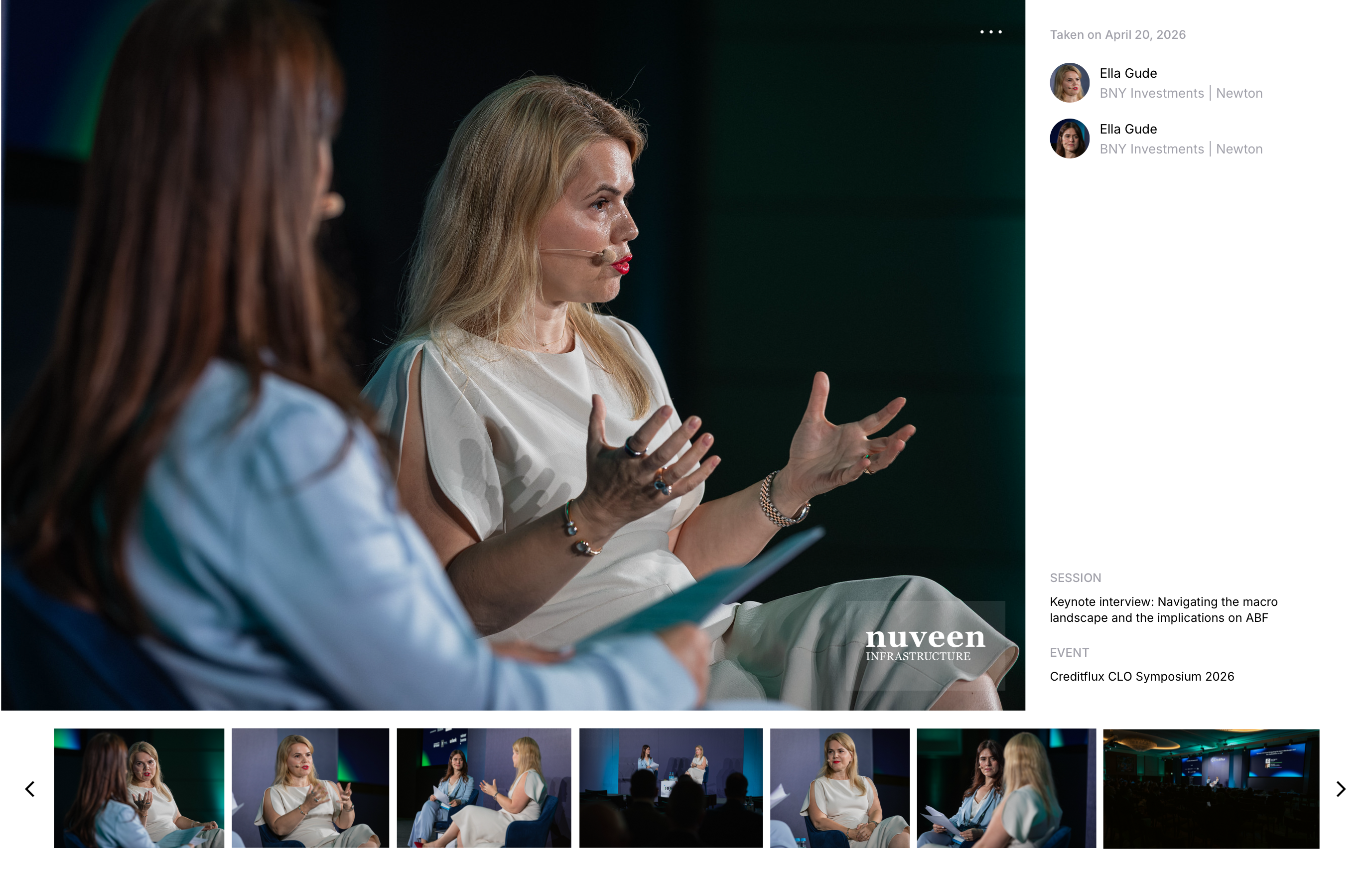
- The viewer at its true size, 1376 wide: a single photo at full size, a metadata panel, and a thumbnail carousel to move through the album. Shown at rest (the more menu is closed).
- The Dark render now carries sponsor tagging: the sponsor logo displayed as a block in the metadata panel (distinct from any watermark on the media). The Light render predates this update, so switch to Dark to see the sponsor tag.
02
Component Anatomy
| # | Part | Colour | Data | Notes |
|---|---|---|---|---|
| 1 | Photo stage | Black | Web Original | The photo at full size on a black backing (1028 x 713 in the master). The stage never crops the photo. |
| 2 | Sponsor watermark | — | Sponsor mark | The sponsor mark applied to the media itself, corner-anchored (Mergermarket in the example). Part of the web original; not the sponsor tag. Optional. |
| 3 | More icon | Icon (White) | — | Overflow (more_horiz), top-right of the photo; opens the actions menu. See Icons. |
| 4 | Fullscreen icon | Icon (White) | — | Expand to fullscreen (fullscreen), top-right corner of the viewer. |
| 5 | Actions menu | SSD1 | Download Share | Popover from the more icon: Download (download) and Share (ios_share) rows, divider between. On a dark panel surface. |
| 6 | Metadata panel | — | — | Right column (288 wide). Holds the taken-on date, tagged people, the sponsor tag, and the session / event block. |
| 7 | Taken-on date | Text 2 | Capture date | Muted date line at the top of the panel (e.g. "Taken on April 20, 2026"). |
| 8 | Tagged person | Text 1 / Text 2 | Person Affiliation | Avatar plus name (Text 1) and affiliation (Text 2, muted). Repeats per tagged person. Reuses the Speaker Strip element. |
| 9 | Session | Text 2 / Text 1 | Session | "SESSION" label (Text 2, muted) over the session title (Text 1). |
| 10 | Event | Text 2 / Text 1 | Event | "EVENT" label (Text 2, muted) over the event name (Text 1). Foot-anchored in the panel. |
| 11 | Sponsor tag | — | Sponsor logo | New. The sponsor's logo lockup displayed as a block in the metadata panel, above the session / event block. A dedicated place to credit the sponsor, distinct from the on-media watermark. Set per photo; optional. |
| 12 | Carousel | SSD1 | Album photo[] | Thumbnail filmstrip (170 tall) with chevron prev / next (chevron_left / chevron_forward) to move through the album. |
Notes
- Sponsor tag vs watermark. Two distinct sponsor placements: the sponsor tag is the sponsor's logo shown cleanly in the metadata panel (the credit), while the watermark is the mark applied to the media itself. They are set independently and can differ, so keep them apart in the build.
- Text binds to the type role grid and to Text / DM: values in Meta, labels and the date in Utility (muted, Text 2), people in Body. The photo, watermark and icons are mode-agnostic white-on-media.
- Flags for the Sketch master: the sponsor tag currently reuses the
Sponsor Lightlockup symbol, so it renders the nuveen mark while the media watermark shows Mergermarket; confirm the intended pairing. Layer names are stale from an Event card (Event Title Copy,Event Subtitle,Date & Time Copy); the Download / Share labels carry no type role and need one; the light render predates the sponsor-tag update. - Reuses existing elements: the Speaker Strip (avatar + name + affiliation) for tagged people, and the Sponsor Light lockup for the sponsor tag.
03
Spacing
| Region | Size | Notes |
|---|---|---|
| Viewer | 1376 wide | Content width; photo + panel above, carousel below |
| Photo stage | 1028 x 713 | Left. ~25 gap to the panel |
| Metadata panel | 288 wide | Right column, full stage height |
| Carousel | 1376 x 170 | Full width below; thumbnails 120 tall |
| Corner icons | 16 inset | More / fullscreen from the top and right edges |
Notes
- Measured off the master (1920 x 1080 artboard; viewer content 1376 wide). The panel is fixed at 288; the photo stage takes the rest of the row.
04
Typography
Session / Event value · Meta
Keynote interview: Navigating the macro landscape
Label / date · Utility · muted (Text 2)
SESSION · Taken on April 20, 2026
Tagged person · Body / sm
Ella Gude · BNY Investments | Newton
Notes
- All three panel slots resolve their colour through Text / DM; muted lines take a Text 2 override. Metrics mirror the Notion Typography Role Registry.
- The Download / Share menu labels are not yet bound to a role (Inter 12, unstyled). Assign a role, likely Utility, when the master is finished.
05
Examples
Examples coming soon: the resting viewer, the more menu open, and the fullscreen state.
Notes
- States to show: default, actions menu open (in the render), and fullscreen.
- The light or alternate surface and both-mode renders follow once the
Photo Asset - DM to DOartboard is resolved.
Components · Photos · Viewer
The photo lightbox, read from the Sketch Photo Details artboards (WDS Design System v3.0). Light and Dark exported; the light conversion is still in progress.
The photo lightbox, read from the Sketch Photo Details artboards (WDS Design System v3.0). Light and Dark exported; the light conversion is still in progress.