Variant 05
↓
Download build packReady to build. Markdown spec to prompt and build from.
Sketch docWDS Design System v3.0
Sketch pageREADY: Components > Events > Cards > 5050 > +DateBlock + Media
+ Date Block + Media
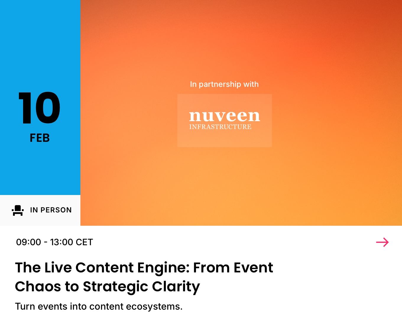
The Date Block card with a stacked media container.
01
Details
Container · 6C (two-up, media-led group)
TierVariant
FamilyEvents
BucketCards
Group5050 (6C)
Variant+ Date Block + Media
Builds on+ Date Block
SizesSmall · Medium · Large (density)
IDevent-card-5050-date-block-media
02
Component Anatomy
| # | Slot | Holds | Colour | Presence | Notes |
|---|---|---|---|---|---|
| 1 | Media Container | Artwork | Surface | Required | The stacked media band: Ribbon (4:1), Letterbox (3:1) or Standard Media (16:9), beside the date tile. See Containers. |
| 2 | Date Block | Date Attendance | Primary Brand Text 1 Icon | Required | The date tile, left of the media. Compact on Ribbon (attendance inline in the Top Slot); full by default on Letterbox / Standard. See Date Block. |
| 3 | Sponsor | Tagline Logo | Text 1 | Optional | Overlay on Letterbox / Standard only: an "In partnership with" tagline and up to two logos. |
| 4 | Top Slot | Time | Text 1 | Required | Time only. The date sits in the Date Block. On Ribbon the attendance icon leads this slot. |
| 5 | Trailing Icon | More / Arrow | Accent | Optional | Top-right affordance. Interactive, so always Accent. See Icons. |
| 6 | Primary | Event Title | Text 1 | Required | The primary line. |
| 7 | Secondary | Event Subtitle | Text 1 | Optional | Venue or subtitle. |
| 8 | Supporting | Location Taxonomy | Text 2 | Optional | Place / category lines. Muted. |
| 9 | Listing Description | Listing Description | Text 1 | Optional | Supporting copy. Deeper media (Standard) suits the lightest copy. |
| 10 | Button | Call to Action | Accent | Optional | CTA label. See Buttons. |
| 11 | Footnote | Footnote | Text 2 | Optional | Foot-anchored fine print. Muted. |
| 12 | Card Background | White / Black | Card fill: White (LM) / Black (DM). Bottom layer. |
Notes
- The copy column, type ramp and spacing are unchanged from + Date Block / Essentials. The media container and Sponsor are the only additions.
- Each container is a fixed frame; crops are handled centrally (Brand Pack > Artwork). The abbreviated name is the container's ID token (
rib/let/stan). - Decreasing copy as the media deepens: Ribbon carries the most, then Letterbox, then Standard.
Media containers
Stacked (supported)
Side by side (too tall a card)
Notes
- Only stacked containers are supported (Ribbon, Letterbox, Standard). Side-by-side (Skyscraper, Vertical Media, Square) don't fit: with the date block in place the card runs too tall for media beside the copy.
- Ribbon is always compact (date-only tile, attendance inline in the Top Slot) so the shallow band has room for the media beside the tile. Letterbox and Standard default to the full date block; compact is also supported.
- A Sponsor overlay (tagline + up to two logos) is available on Letterbox and Standard, not Ribbon.
03
Spacing
Notes
- Spacing is standard as per + Date Block; the copy column follows the Essentials model. The media container and date tile occupy the top band; the copy column below is unchanged.
04
Typography
Notes
- Copy typography is standard as per Essentials.
- The Date Block's own type (date numerals, month, attendance label) is defined on the Date Block element.
05
Examples
Notes
- Examples coming soon.
Events · Cards · 5050 · + Date Block + Media
The Date Block card with a Ribbon, Letterbox or Standard Media container. Details, anatomy and type read from the live Sketch master (WDS Design System v3.0).
The Date Block card with a Ribbon, Letterbox or Standard Media container. Details, anatomy and type read from the live Sketch master (WDS Design System v3.0).