Ready
Variant 02
↓
Download build packReady to build. Markdown spec to prompt and build from.
Sketch docWDS Design System v3.0
Sketch pageREADY: Components > Events > Cards > Foreseeable > + Media
+ Media
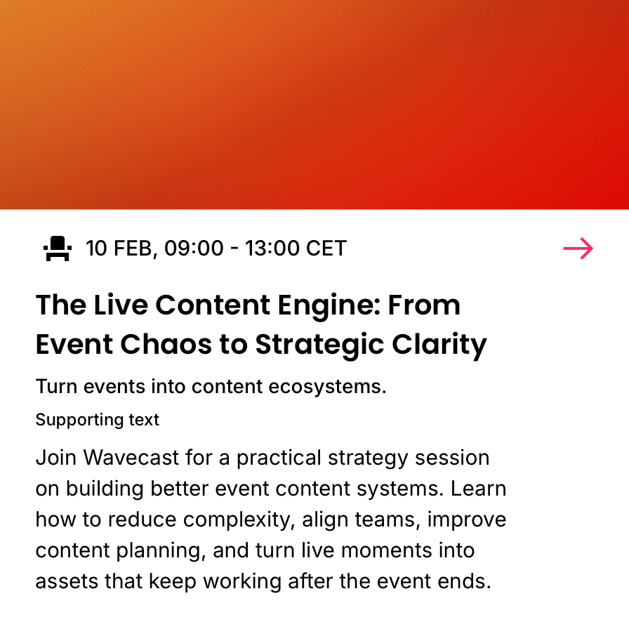
The base card with 1x Media Container.
01
Details
Container · 4C (media added to the Essentials base)
TierVariant
FamilyEvents
BucketCards
GroupForeseeable (4C)
Variant+ Media
Builds onEssentials
SizesSmall · Medium · Large (density)
Size handledata-size="sm · md · lg" (on the card root, the CSS override hook)
Canonical nameEvents / Cards / Foreseeable / + Media
IDevent-card-4c-essentials-media
Media containers
The following media containers are supported:
Supported on 4C
Not on 4C (needs a wider card)


Notes
- Every container is a fixed frame with a fixed aspect ratio.
- Artwork is pre-set to each frame (Brand Pack > Artwork).
- Skyscraper can only be used on the left side; all others stack on top.
- Skyscraper suits a short, wide card (eyebrow and title); among the stacked containers a shallow one (Ribbon) carries more content, a deep one (Standard) carries less.
- The abbreviated name is the container's ID token, encoded in the card id (for example
…-media-sky). - Each container preview shows the three card sizes (Small, Medium, Large) at true size, centred in a fixed-height panel so the toggle compares like for like.
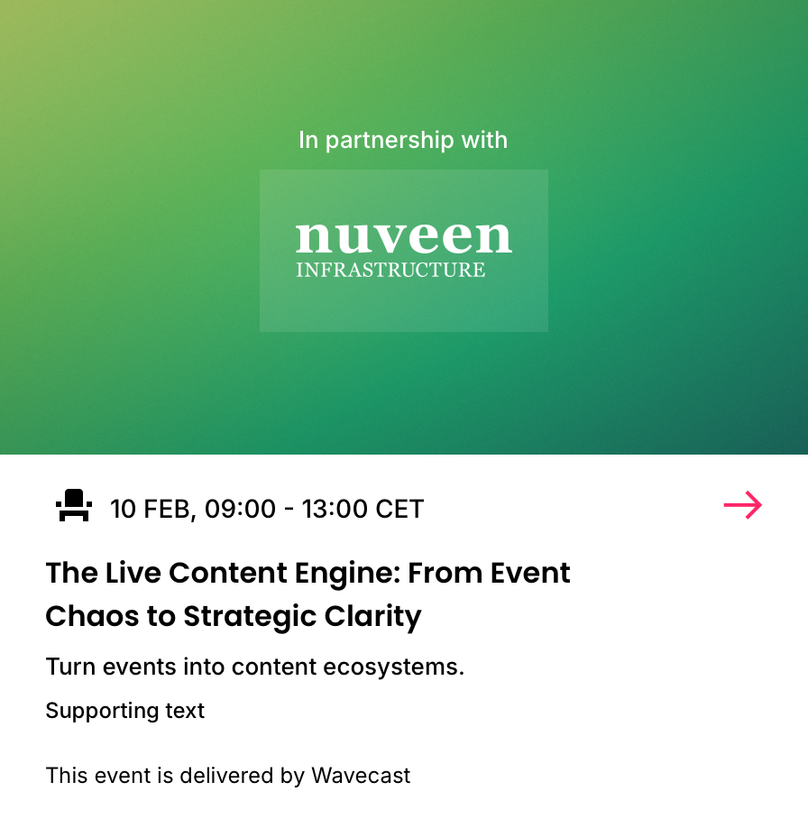
- Only
media-stansupports Sponsor overlays (a tagline and up to two logos).
02
Examples
See + Media across every example card, by container. View examples →
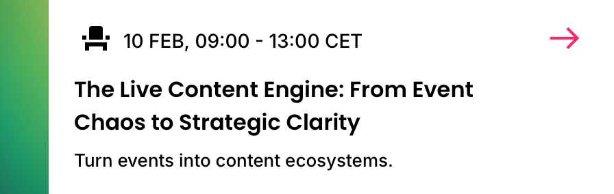
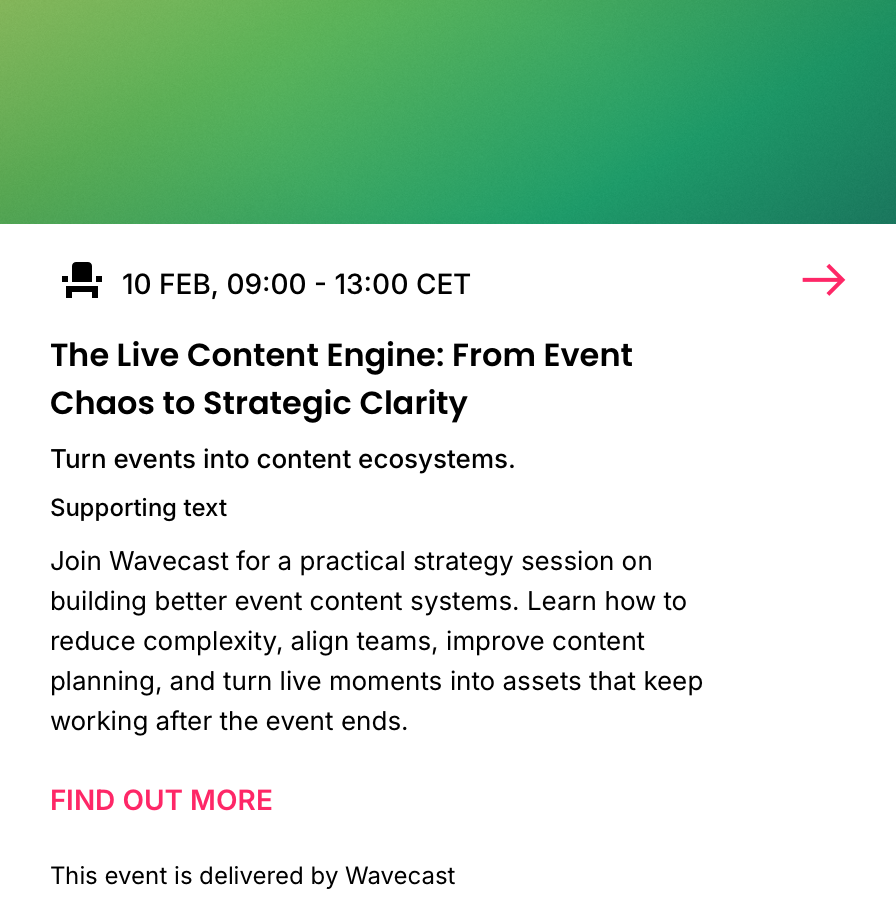
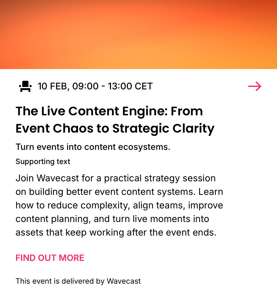
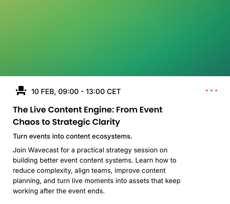
Events · Cards · Foreseeable · + Media
Essentials plus a media container. Details, anatomy and data are read from the live Sketch master (WDS Design System v3.0). Re-export the renders when the component changes.
Essentials plus a media container. Details, anatomy and data are read from the live Sketch master (WDS Design System v3.0). Re-export the renders when the component changes.