Ready
Variant 02
↓
Download build packReady to build. Markdown spec to prompt and build from.
Sketch docWDS Design System v3.0
Sketch pageREADY: Components > Events > Cards > FW > Essentials + Media + Speakers
Essentials + Speakers
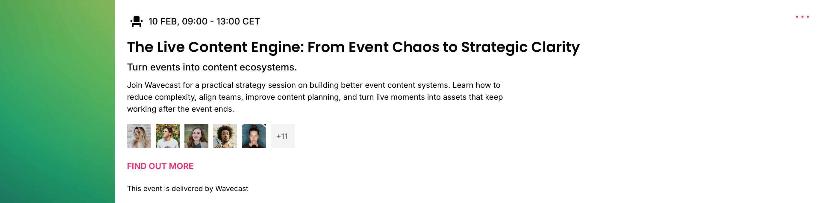
The base card with a Speaker Strip.
01
Details
Container · 12C (full content width, one event per row)
TierVariant
FamilyEvents
BucketCards
GroupFW (12C)
VariantEssentials + Speakers
Builds onEssentials
Canonical nameEvents / Cards / FW / Essentials + Speakers
IDevent-card-fw-speakers




02
Component Anatomy
Notes
- The speaker strip sits inside the content column: up to five avatars at an 8px gap, plus a +N overflow counter. Avatar shape (Circle / Square) is a per-card setting; shown here in Square.
- The strip introduces no new colour; avatar frame and counter inherit the card's surface and Text tokens. It composes with any media container.
- Media panel (optional). The side-mounted panel supports Skyscraper (1:4), Vertical Media (9:16), Square (1:1) and Standard Media (16:9). No container leaves the card text-and-speakers across the rail.
- The slot model, roles and content schema are inherited from Essentials; the strip and the media panel are the only additions.
- Every container is shown true-size in both modes; the preview stage is fixed-height so the toggle compares like for like.
03
Spacing
Notes
- Base slot spacing is standard as per Essentials.
- The speaker strip adds a gap above and below itself within the content column.
04
Typography
Notes
- Typography is standard as per Essentials; the speaker strip adds no text slots.
05
Examples
Notes
- Examples coming soon.
Events · Cards · FW · Essentials + Speakers
The full-width base plus a Speakers strip, with an optional side media panel. Details mirror the live Sketch master (WDS Design System v3.0).
The full-width base plus a Speakers strip, with an optional side media panel. Details mirror the live Sketch master (WDS Design System v3.0).