Variant 04
↓
Download build packReady to build. Markdown spec to prompt and build from.
Sketch docWDS Design System v3.0
Sketch pageREADY: Components > Events > Cards > 5050 > +DateBlock Variants
+ Date Block
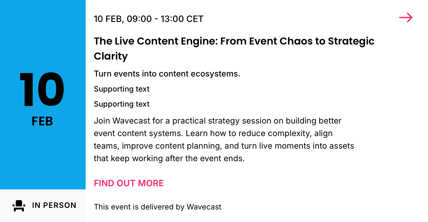
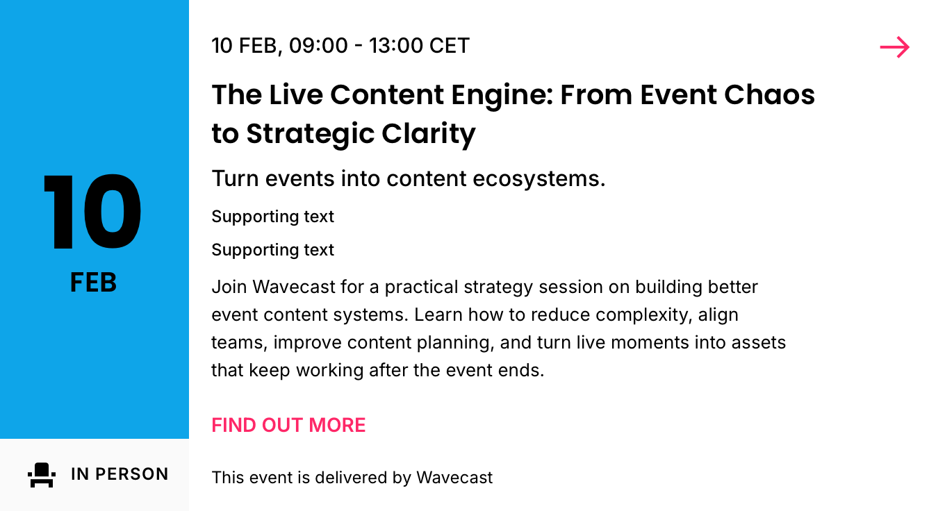
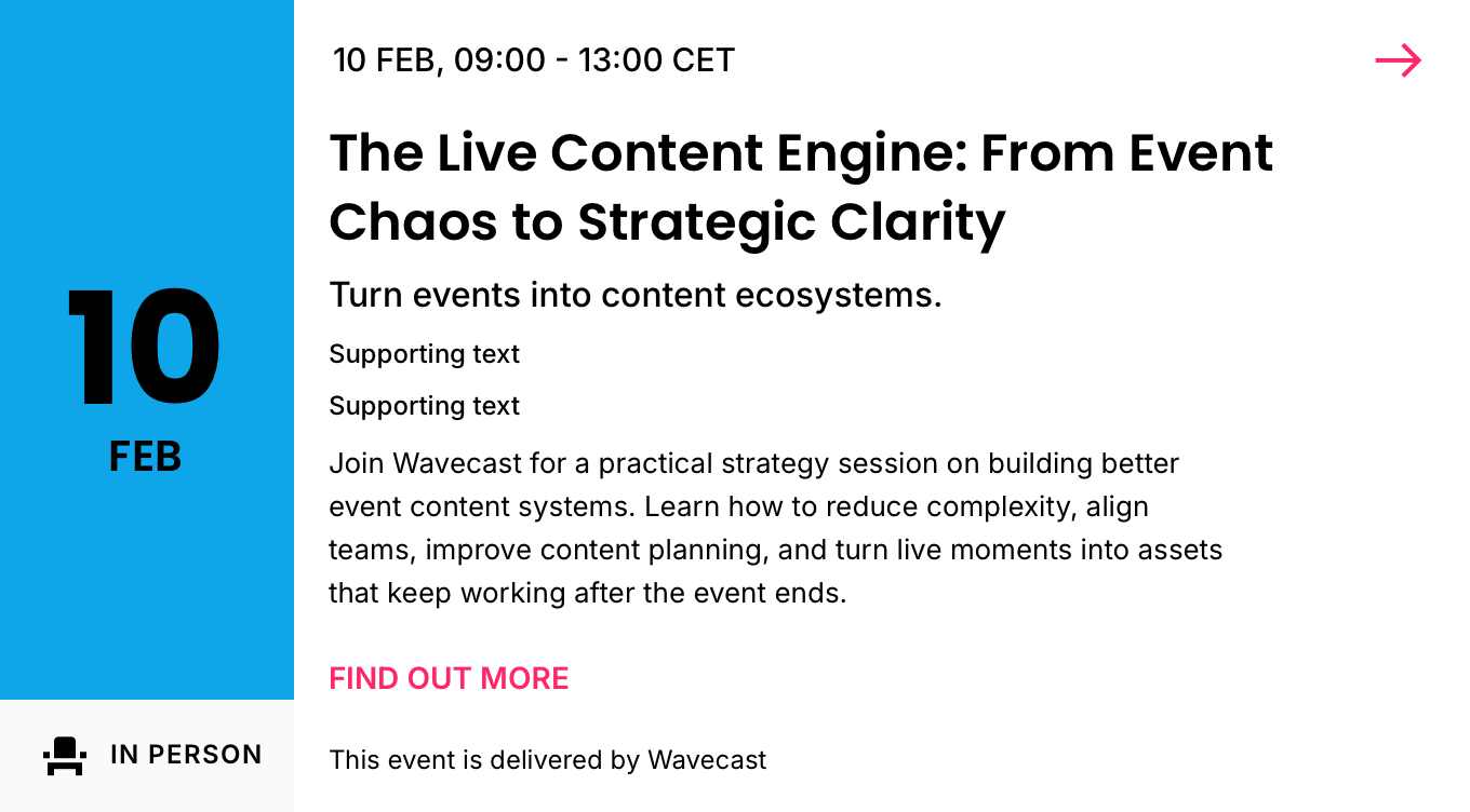
The base card with Date Block.
01
Details
Container · 6C (two-up, media-led group)
TierVariant
FamilyEvents
BucketCards
Group5050 (6C)
Variant+ Date Block (default · variable height)
SizesSmall · Medium · Large (density)
Canonical nameEvents / Cards / 5050 / + Date Block
IDevent-card-5050-date-block
02
Component Anatomy
| # | Slot | Holds | Colour | Presence | Notes |
|---|---|---|---|---|---|
| 1 | Date Block | Date Attendance | Primary Brand Text 1 Icon | Required | The embed, left of the copy: a Block background container carrying the date, with an Icon & Label beneath carrying the attendance mode. The container takes the Primary Brand colour by default but can hold artwork: a flexing image, not a standardised media crop (it flexes with the block, particularly on the default flexible-height build). Label surface is Neutral 1; icon & text are Text 1. The date is a centralised day + month (e.g. 10 FEB), or month + year for a past or multi-year event. See Date Block. |
| 2 | Top Slot | Time | Text 1 | Required | Time only. The date moves into the Date Block, so this slot drops it (e.g. 09:00 – 13:00 CET). No leading icon; the attendance icon sits in the Date Block label. |
| 3 | Trailing Icon | — | Accent | Optional | Top-right affordance: the More menu (M / L) or a forward Arrow (S). See Icons. |
| 4 | Primary | Event Title | Text 1 | Required | The primary line. Source Event Title or Listing Title per card. |
| 5 | Secondary | Event Subtitle | Text 1 | Optional | Venue or subtitle. |
| 6 | Supporting | Location Taxonomy | Text 2 | Optional | Place / category lines. Muted. |
| 7 | Listing Description | Listing Description | Text 1 | Optional | Supporting copy; follows the supporting slots. |
| 8 | Button | Call to Action | Accent | Optional | CTA label (e.g. "FIND OUT MORE"). See Buttons. |
| 9 | Footnote | Footnote | Text 2 | Optional | Foot-anchored fine print. Muted. |
| 10 | Card Background | White / Black | Card fill: White (LM) / Black (DM). Bottom layer. |
Notes
- + Date Block is the date-presentation build of Essentials, with full Essentials support, same data and slot rules. The only structural change is that the date and attendance move out of the Top Slot and into the Date Block.
- The Block background container takes the Primary Brand token by default (constant across modes) and can accept artwork: a flexing image, not a standardised media crop. The date numerals are Text 1 (dark LM / white DM); the label surface, icon and text are token-derived (Neutral 1 surface · Text 1 icon/text).
- Visibility of the optional slots is a per-card setting, not a separate variant. Absent slots close up.
03
Spacing
| Position | Applies to | Above | Below |
|---|---|---|---|
| Top | Top Slot, to the top edge | 12 sm | 8 xs |
| Between | Every other slot | 8 xs | 8 xs |
| Bottom | Terminal text slot: Title, Subtitle or Listing Description | 8 xs | S 16 md · M / L 24 xl |
| Bottom | Button (CTA block) | 20 lg | 20 lg |
| Bottom | Footnote | 20 lg | 16 md |
Notes
- The copy column follows the Essentials spacing model. Spacing scale: xs 8 · sm 12 · md 16 · lg 20 · xl 24.
- Interior gaps are constant across all three sizes; only the bottom edge under a terminal text slot steps with size, from md 16 at Small to xl 24 at Medium and Large.
- The Date Block is a fixed-width embed in the left column; its height tracks the card (variable height).
04
Typography
Notes
- Copy typography is standard as per Essentials.
- The Date Block's own type (date numerals, month, attendance label) is defined on the Date Block element.
05
Examples
The + Date Block card in its three configurations (full, fixed height, compact), in Light and Dark. View examples →
Notes
- Fixed height is a slot setting; Compact carries a structural change and may become its own variant.
Events · Cards · 5050 · + Date Block
The date-presentation 5050 build, where date and attendance move into the Date Block. Details, anatomy and type read from the live Sketch master (WDS Design System v3.0).
The date-presentation 5050 build, where date and attendance move into the Date Block. Details, anatomy and type read from the live Sketch master (WDS Design System v3.0).